Hi, I’m starting this learning GPUI series completely out of curiosity to learn about GPUI and share whatever I learn with you. One thing that I can assure you is that we will follow the same pattern as the rest of my articles, we will build one interesting project per article and learn the concepts required to build that project. I’ll try to post one article on GPUI every 2 weeks but can’t promise on that, it might be 3 weeks per article as well.
By the end of this article, we will have this kind of UI:
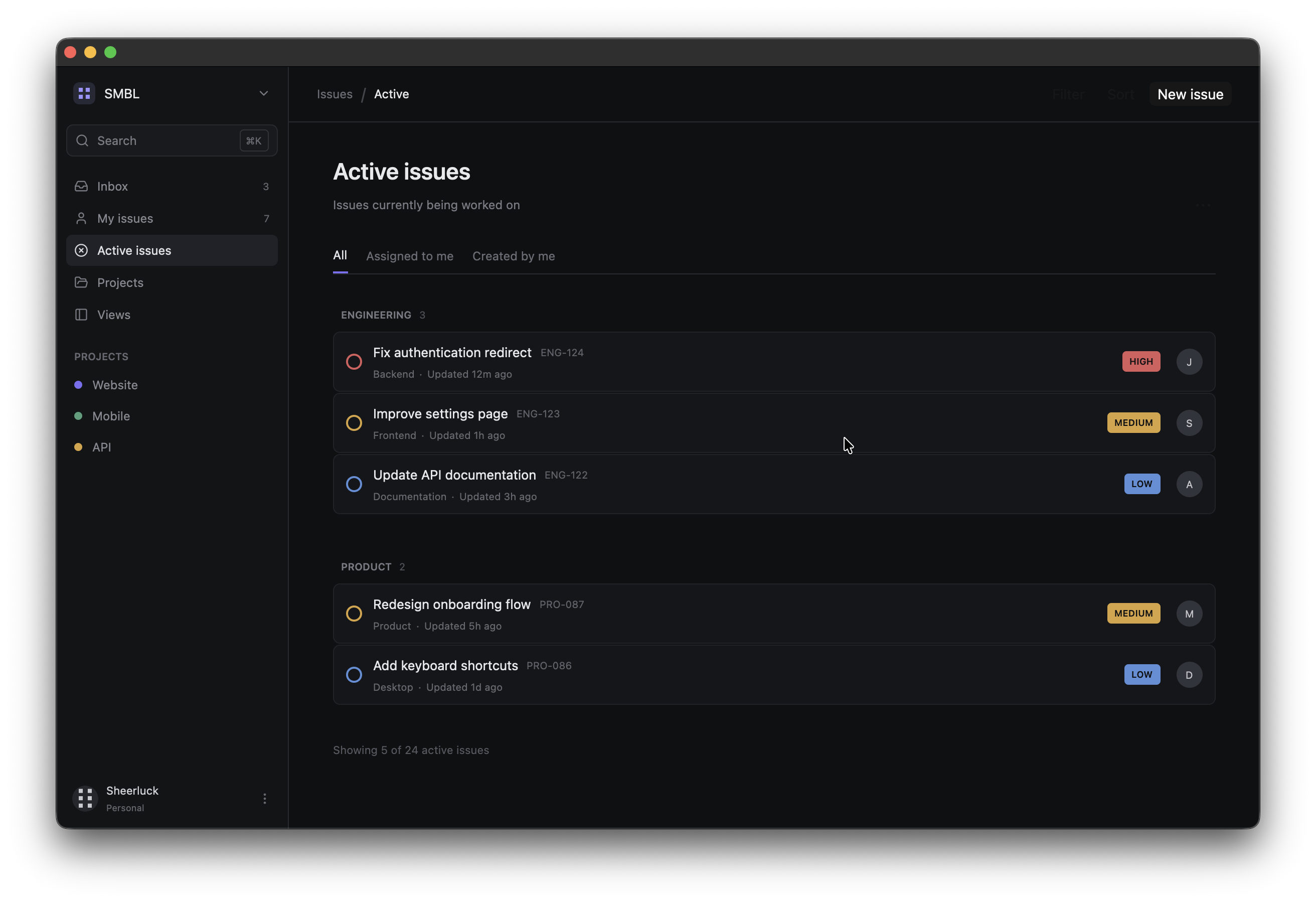
Let’s just start learning GPUI and in this article we are focusing on implementing layouts and styling in GPUI and we will build a linear like UI clone where we will have a static issue-tracking interface. It’ll have a sidebar, navigation, projects, a header, tabs and issue cards.
You can get the source code from here
GPUI is a Rust UI framework developed by the team behind Zed. It is designed to build native desktop applications using Rust and the interface itself is described using Rust code.
Pre-Requisites
- Rust programming language
- Have Rust installed on your machine (installation guide)
- HTML and CSS (just basics so that you’d clearly understand concepts like flex, margin, padding etc) I would highly urge you to not move forward if you don’t know the basics of Rust or basic Html and Css. Please get some basic knowledge on the pre-requisites and then come back.
As GPUI is evolving, you may encounter some breaking changes in future versions. If you do, then please inform me so that I can update the article accordingly. You can either go to the blog’s Github repo’s issues tab and create a new issue or inform me through any social media channels.
Creating the Project
Let’s start by creating a new Rust project:
cargo new gpui-issue-tracker-uiOpen the project in your preferred editor.
Lets start by adding dependencies to Cargo.toml:
[package]
name = "gpui-issue-tracker-ui"
version = "0.1.1"
edition = "2024"

[dependencies]
gpui-kit = "0.6"
rust-embed = "8"
anyhow = "1"
Here, we added the gpui-kit dependency, which brings GPUI, the platform-specific application entry point, GPUI Component, and its bundled assets together. rust-embed allows us to embed our own application assets into the binary, and anyhow is used for error handling.
Creating the Smallest Possible GPUI Application
We are going to build this application incrementally, so that after every step you can run the application and check how its looking. Ok, lets start by opening src/main.rs and importing GPUI:
use gpui_kit::*;Now, lets define an application view:
struct App;At this point, App doesn’t do anything, we need to tell GPUI how this view should be rendered.
The Render trait
Lets implement Render for App:
impl Render for App {
	fn render(&mut self, _window: &mut Window, _cx: &mut Context<Self>) -> impl IntoElement {
		div().child("Hello, GPUI!")
	}
}
This impl Render for App tells GPUI that App is a view that can produce the UI. The render method returns impl IntoElement to construct an element tree. If you think in terms of HTML, you just created a div element and added a child that has the text Hello, GPUI!
You can visualise the element tree like this:
App
└── div
    └── "Hello, GPUI!"
This is the kind of pattern we will follow for the rest of the article where a GPUI view renders an element and elements can contain other elements just like we do in HTML.
Let me explain a bit about the Render trait as well. fn render is the method i=required by the Render trait, the &mut self mean render method receives a mutable reference to our App instance. So, when we will start using things like app state in future, we can pass that state using this. The next thing is _window: &mut Window, this gives the render method mutable access to the current GPUI window. You can see its written like this _window because we are not using it right now, we are saying “we know this parameter exists, but I’m not using it”. We will start using it later once we work on things like focus, input etc. Finally, we have the context _cx: &mut Context<Self>, this context provides access to GPUI functionality associated with this particular view. For example, in our future article we can use context to notify GPUI that the view’s state has changed, its actually great when we are handling event. Here also we are using that underscore format just to meant that we are not using it right now.
Starting the GPUI Application
Now, we need Root from GPUI Kit’s component layer. Let’s update our imports to:
use gpui_kit::*;
use gpui_kit::component::Root;
Now add a main function:
fn main() {
	let app = gpui_kit::application();

	app.run(|cx| {
		gpui_kit::init(cx);

		cx.open_window(
			WindowOptions::default(),
			|window, cx| {
				let view = cx.new(|_| App);
				cx.new(|cx| Root::new(view, window, cx))
			},
		)
		.expect("failed to open window");
		cx.activate(true);
	});
}
First, we are creating our application let app = gpui_kit::application();, then once our app is ready, app.run(|cx| {...}); we start its event loop and this gives us an application context cx. After we get the context of the app, we initialise GPUI Kit and its enabled components with gpui_kit::init(cx);.
Once all this is done, we start by creating the window for our app cx.open_window(...). I’m not going to explain all the details here, I’ll explain them later in this article.
Now, if you’ll run the app using cargo run, you should see a window with the text Hello GPUI!
Giving the Window a Predictable Size
Right now, our app has a default window size due to this lineWindowOptions::default(), lets change that and have a specific window size for our app. Instead of WindowOptions::default(), use this:
WindowOptions {
    window_bounds: Some(WindowBounds::Windowed(Bounds {
        origin: point(px(0.0), px(0.0)),
        size: size(px(1200.0), px(760.0)),
    })),
    ..Default::default()
}
Run it and you see something like this:
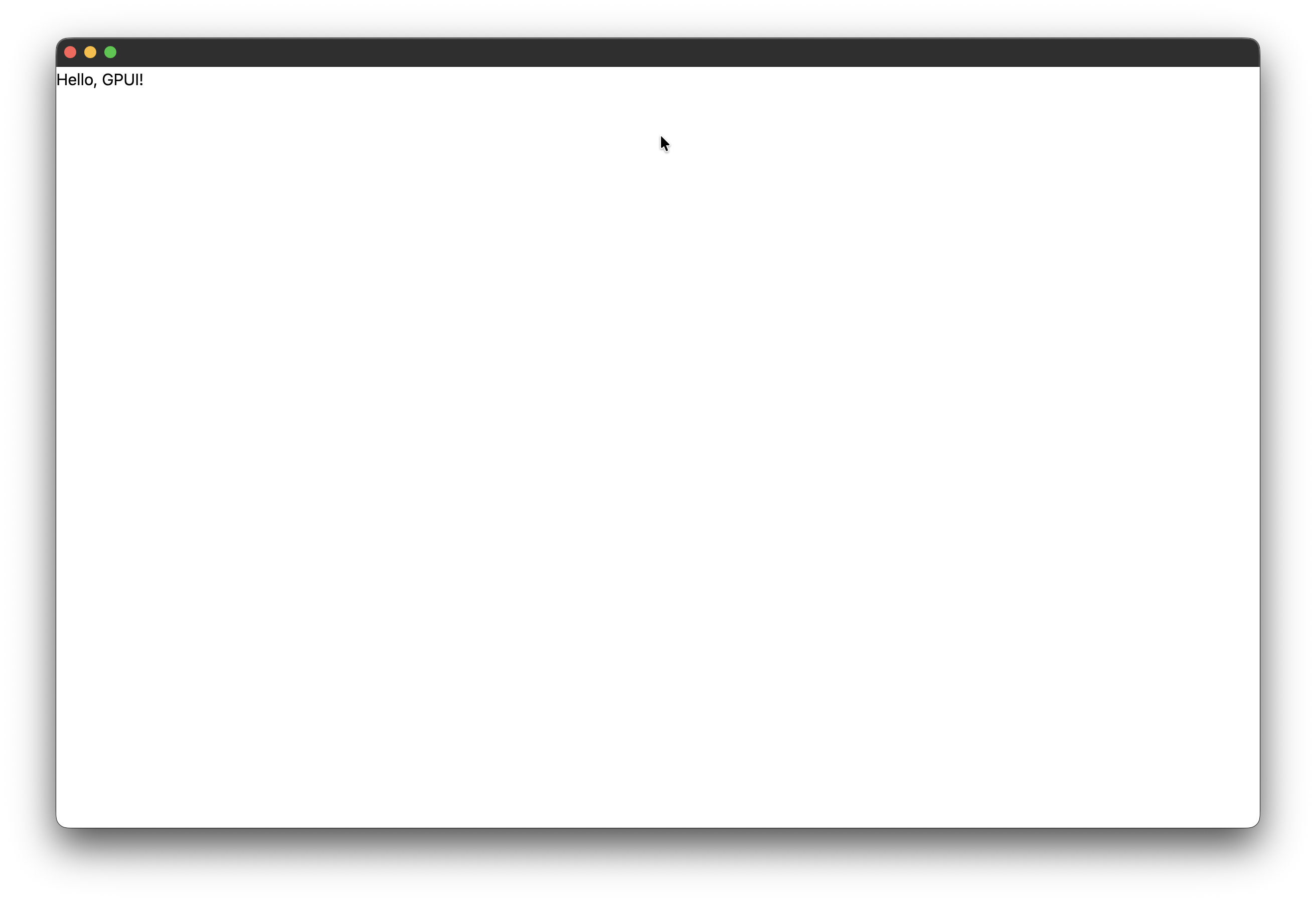 You can see that with the default option and now with specific size, the window size actually changes, you can try different sizes to check for yourself
You need to note that, in GPUI, we need to represent dimensions using GPUI typed units like px().
Making our Element Fill the Window
Right now our div only contains the text, lets make it occupy the entire available space or window. Let’s modify the render method to this:
impl Render for App {
    fn render(&mut self, _window: &mut Window, _cx: &mut Context<Self>) -> impl IntoElement {
        div()
            .size_full()
            .child("Hello, GPUI!")
    }
}
If you’ll run it, you won’t see any change because there’s no background colour for our div, hence even though its now taking the entire window, we can’t realise that, so lets add a background colour.
Adding Colour
Add a background colour and text colour:
impl Render for App {
    fn render(&mut self, _window: &mut Window, _cx: &mut Context<Self>) -> impl IntoElement {
        div()
            .size_full()
            .bg(rgb(0x0f1012))
            .text_color(rgb(0xe8e9ea))
            .child("Hello, GPUI!")
    }
}
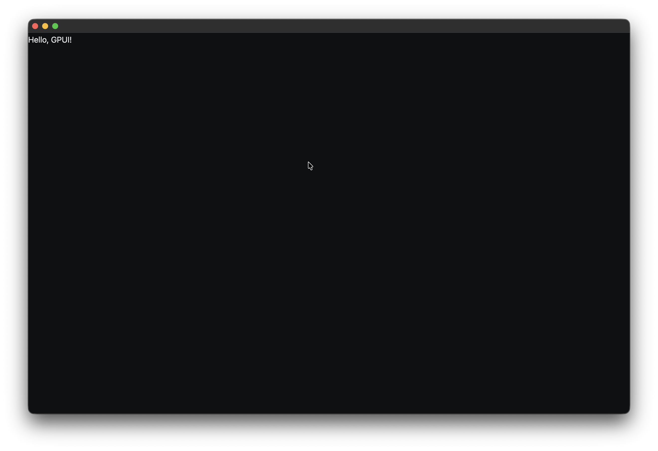
Now, run it and you’ll see that the background is in black colour and text is in light colour. We are representing colour in RGB hexadecimal notation.
One thing you can notice by now is that, in GPUI, we create an element and just configure it by chaining methods.
Nested Elements
Of course, to build any complex layout, we need to know how to use or nest multiple elements, so lets’ start learning about it. Change the render method to this:
impl Render for App {
    fn render(&mut self, _window: &mut Window, _cx: &mut Context<Self>) -> impl IntoElement {
        div()
            .size_full()
            .bg(rgb(0x0f1012))
            .text_color(rgb(0xe8e9ea))
            .child(
                div()
                    .child("Hello, GPUI!"),
            )
    }
}
Run it and you’ll see that visually its still the same but the important thing to note here is, our element tree now looks like this:
App
└── div
    └── div
        └── "Hello, GPUI!"
The outer div is our application container, the inner div is its child and the .child() method is one of the fundamental methods we’ll use in GPUI. Its a way to have that parent-child structure for nested or sibling element structures
Creating a Two-Column Layout
Our final app has a sidebar and a main content area. To achieve that, we need to know how to create column layouts and we can do that using flexbox. Let’s change the inner div to this:
div()
    .size_full()
    .flex()
    .flex_row()
    .child(sidebar())
    .child(main_content())
You can see we are using two functions sidebar() and main_content(), these are two helper functions that we are going to create, this will help us to maintain and reuse our code
fn sidebar() -> impl IntoElement {
    div()
        .w(px(232.0))
        .h_full()
}
We are creating a sidebar component that has a width of 232px and it takes complete height of the window and the main content layout takes the remaining width of the window and the full height of the window:
fn main_content() -> impl IntoElement {
    div()
        .flex_1()
        .h_full()
}
Now, our render method should look something like this:
impl Render for App {
    fn render(&mut self, _window: &mut Window, _cx: &mut Context<Self>) -> impl IntoElement {
        div()
            .size_full()
            .bg(rgb(0x0f1012))
            .text_color(rgb(0xe8e9ea))
            .child(
                div()
                    .size_full()
                    .flex()
                    .flex_row()
                    .child(sidebar())
                    .child(main_content()),
            )
    }
}
You can run and see that the text is gone and the entire app has a dark background colour, that’s all, we can’t visibly see the sidebar and main content area. Let’s now work on the sidebar container
Building the Sidebar Container
Replace the sidebar() with this:
fn sidebar() -> impl IntoElement {
    div()
        .w(px(232.0))
        .h_full()
        .flex()
        .flex_col()
        .bg(rgb(0x131416))
        .border_r_1()
        .border_color(rgb(0x272a2f))
        .px(px(10.0))
        .py(px(10.0))
        .gap(px(14.0))
}
Now, if you’ll run it, you can see that the sidebar layout is there.
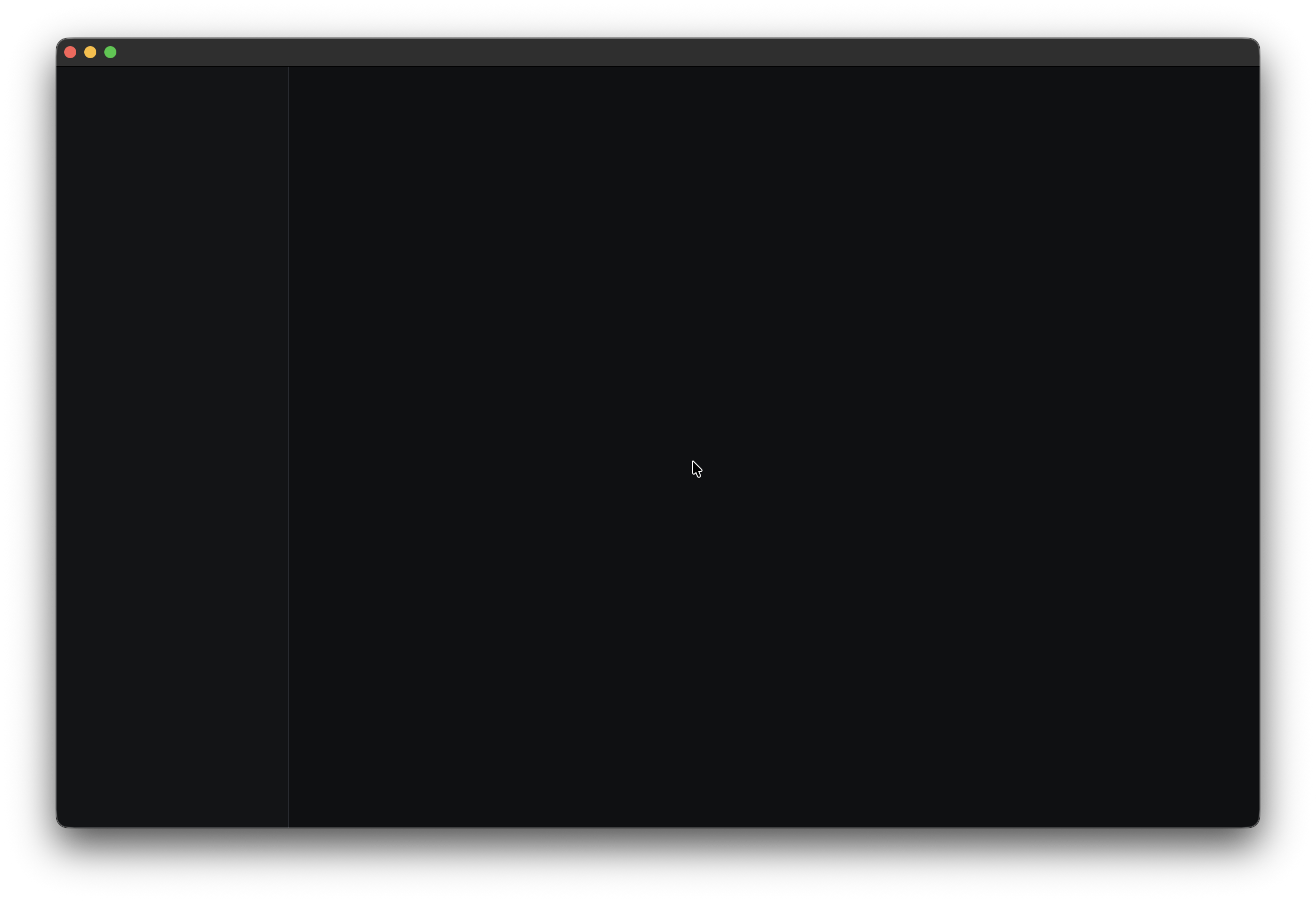 We just have the same fixed width for sidebar and it takes height as the total height of the window. Then we turn this sidebar into a flex container with
 flex() and flex_col() is used so that its children will be arranged vertically. Then we set the background and border and finally we set the padding for horizontal and vertical axis and gap as well.
Adding the Workspace Selector
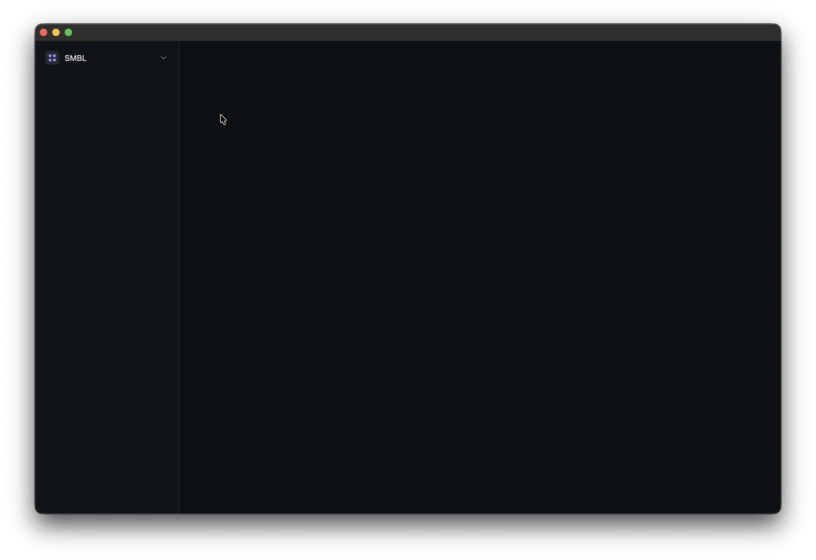
Now, its time to add some content to the sidebar. The first thing we will add is the workspace selector. Add this child to the end of the sidebar:
Please go ahead to the github repo and download the images from the assets folder and create a assets folder in your project’s root as well. Otherwise the sections from now might not work or at least won’t render the two custom assets that we are going to use.
First, lets update our imports so that we can use icons and assets:
use gpui_kit::component::{
    Icon,
    IconName,
    Root,
    Sizable,
    button::{Button, ButtonVariants},
};
use gpui_kit::gpui::prelude::FluentBuilder;
use gpui_kit::*;.child(
div()
.h(px(34.0))
.flex()
.items_center()
.px(px(7.0))
.rounded(px(7.0))
.hover(|this| this.bg(rgb(0x1d2024)))
.child(img("org.svg").size(px(22.0)).rounded(px(6.0)))
.child(
div()
.ml(px(9.0))
.flex_1()
.text_size(px(13.0))
.font_weight(FontWeight::MEDIUM)
.child("SMBL"),
)
.child(
Icon::new(IconName::ChevronDown)
.size(px(14.0))
.text_color(rgb(0x777b83)),
),
)From now on, I don’t think I need to explain the styling methods that we are using as it should be easy to reason about what we are trying to do. If you still think, I should explain, please let me know, I’ll edit the article and add more explanations if needed.
The two custom svgs that we use in this project are org.svg: its used by the workspace selector and user.svg: its used by the user section at the bottom of the sidebar.
We want these files embedded into the application rather than relying on them being present beside the executable at runtime.
That’s why we added rust-embed to Cargo.toml. At the top of the main.rs, just add:
use std::borrow::Cow;

use anyhow::Result;
use rust_embed::RustEmbed;
Then define the embedded asset collection like this:
#[derive(RustEmbed)]
#[folder = "assets"]
struct AppAssets;
The #[folder = "assets"] attribute tells rust-embed to include everything inside our assets directory. Now we need to make these assets available to GPUI Kit. To do that, we need to write this:
impl AssetSource for AppAssets {
    fn load(&self, path: &str) -> Result<Option<Cow<'static, [u8]>>> {
        if let Some(file) = AppAssets::get(path) {
            return Ok(Some(file.data));
        }

        gpui_kit::assets::Assets.load(path)
    }

    fn list(&self, path: &str) -> Result<Vec<SharedString>> {
        let mut files = AppAssets::iter()
            .filter(|file| file.starts_with(path))
            .map(SharedString::from)
            .collect::<Vec<_>>();

        files.extend(gpui_kit::assets::Assets.list(path)?);

        Ok(files)
    }
}
So there are two asset sources here, the first one is our own application assets AppAssets::get(path). If the requested file exists in our assets directory, we return it; otherwise, we fall back to GPUI Kit’s bundled assets with gpui_kit::assets::Assets.load(path). The same pattern is used by list() to expose both asset sources.
Now that this is done, we need to register this asset source with the application, so change this let app = gpui_kit::application(); to this:
let app = gpui_kit::application().with_assets(AppAssets);now, if you’ll run this, you should see:
Building the Search Box
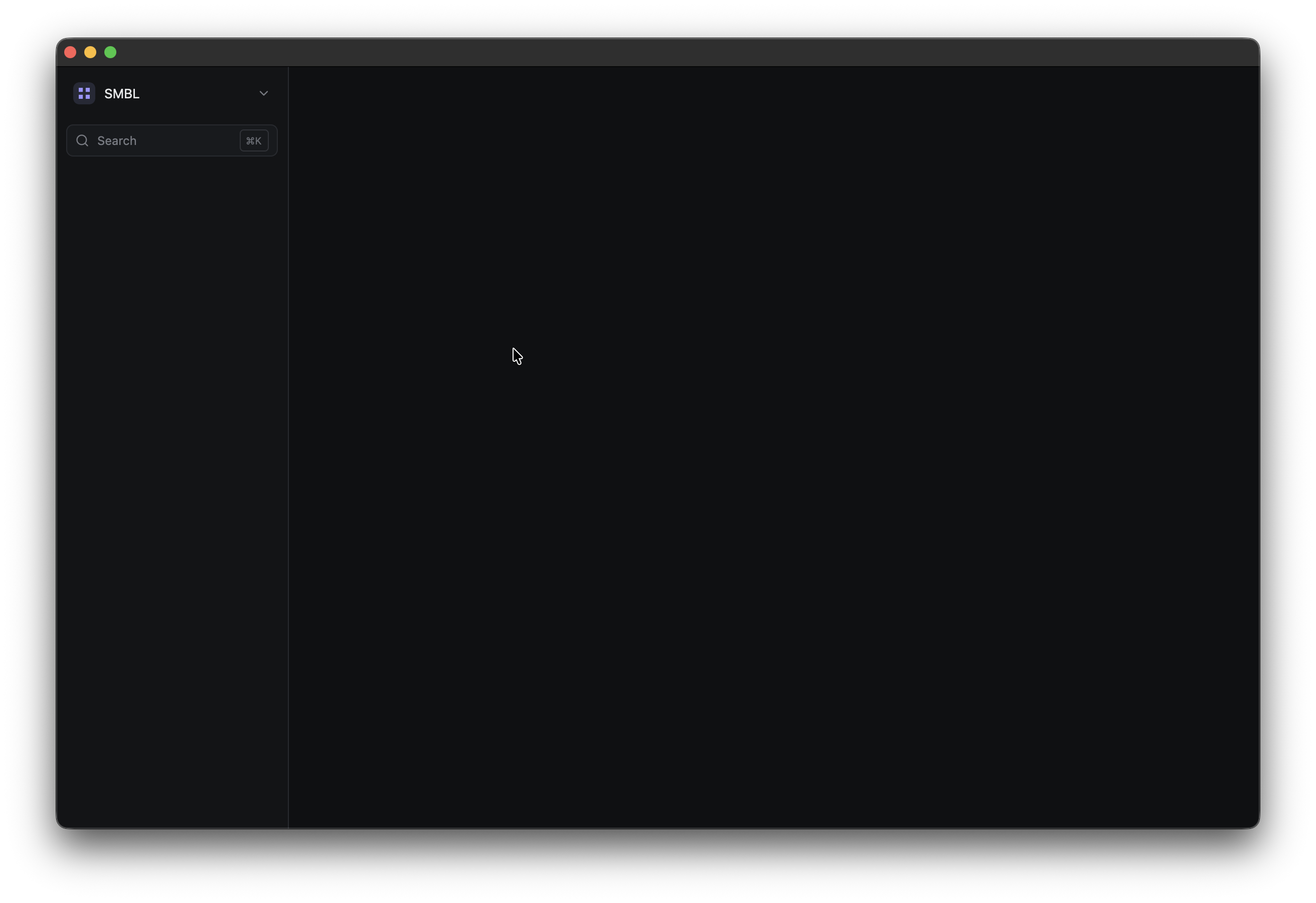
Now, lets add the search box right below the workspace selector. lets add a child() after the workspace element:
.child(
    div()
        .h(px(32.0))
        .flex()
        .items_center()
        .px(px(8.0))
        .rounded(px(7.0))
        .bg(rgb(0x181a1d))
        .border_1()
        .border_color(rgb(0x272a2f))
        .child(
            Icon::new(IconName::Search)
                .size(px(14.0))
                .text_color(rgb(0x777b83)),
        )
        .child(
            div()
                .ml(px(8.0))
                .flex_1()
                .text_color(rgb(0x777b83))
                .text_size(px(12.0))
                .child("Search"),
        )
        .child(
            div()
                .px(px(5.0))
                .py(px(2.0))
                .rounded(px(4.0))
                .border_1()
                .border_color(rgb(0x303339))
                .text_color(rgb(0x696d75))
                .text_size(px(10.0))
                .child("⌘K"),
        ),
)
If you’ll run this, you should see something like this:
Creating Reusable Navigation Items
Now, lets learn another pattern, sometimes we want to create several elements may be buttons, options or something else that share the same structure.
For example, right now we want to create several navigation entries and they all have the same structure, instead of duplicating the layout, lets create a helper function like we did for sidebar and main content:
fn sidebar_item(
    icon: IconName,
    label: &'static str,
    count: Option<&'static str>,
    active: bool,
) -> impl IntoElement {
    div()
        .h(px(31.0))
        .flex()
        .items_center()
        .px(px(8.0))
        .rounded(px(6.0))
        .when(active, |this| this.bg(rgb(0x202227)))
        .hover(|this| this.bg(rgb(0x1d2024)))
        .child(Icon::new(icon).size(px(14.0)).text_color(if active {
            rgb(0xd9dbe0)
        } else {
            rgb(0x777b83)
        }))
        .child(
            div()
                .ml(px(9.0))
                .flex_1()
                .text_size(px(12.0))
                .text_color(if active { rgb(0xe0e1e4) } else { rgb(0x858990) })
                .child(label),
        )
        .when_some(count, |this, count| {
            this.child(
                div()
                    .text_size(px(10.0))
                    .text_color(rgb(0x656970))
                    .child(count),
            )
        })
}
This function takes icon, label, count, active. These are all the things that we will pass to this function when we want to create a nav entry and depending on these values, the nav element will show up differently.
We will use
'staticfor all of our string literal inputs because we want their lifetime to be valid as long as the program exists. In later articles, we will see how we can use a store system to implement this in a better way
I want you to notice that when() is a conditional API that renders things depending on the condition. For now, we are checking if the element is active or not, if yes then apply a certain background colour, we are doing the same kind of thing for text colour as well.
There’s one more called when_some(), this adds the count element only when a count was supplied. Of course, I can’t cover all the methods or details about in-built GPUI methods, you can look it up later. But these things are interesting
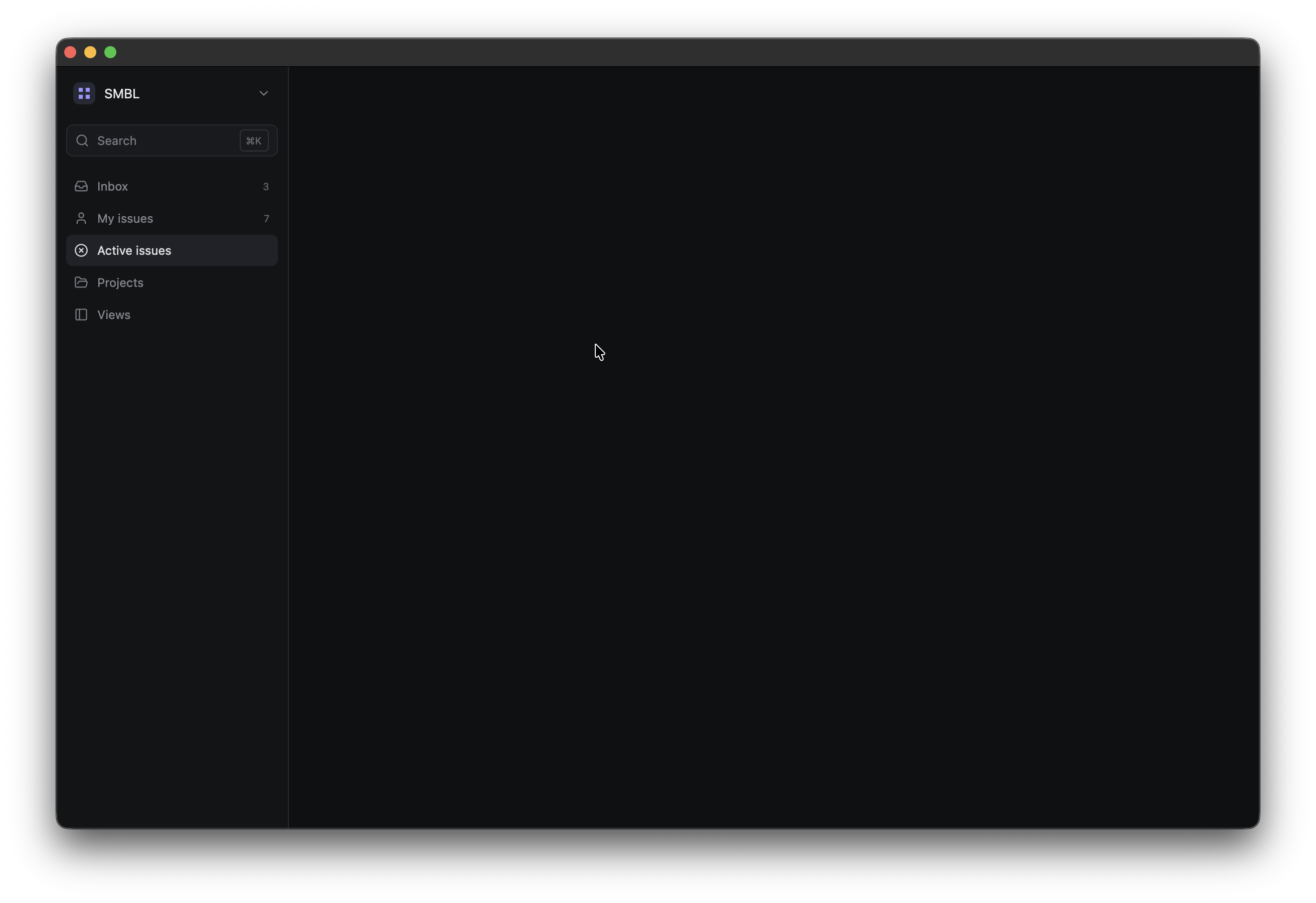
Now, once this is done, we can add the navigation section to sidebar():
.child(
    div()
        .flex()
        .flex_col()
        .gap(px(1.0))
        .child(sidebar_item(IconName::Inbox, "Inbox", Some("3"), false))
        .child(sidebar_item(IconName::User, "My issues", Some("7"), false))
        .child(sidebar_item(IconName::CircleX, "Active issues", None, true))
        .child(sidebar_item(IconName::FolderOpen, "Projects", None, false))
        .child(sidebar_item(IconName::PanelLeft, "Views", None, false)),
)
If you run it, you’ll see something like this, its look really good right now. We just added another child element to sidebar and added multiple child element by using our sidebar_item helper function with different values. Please experiment with different values to understand how its working
Adding the Projects Section
Lets add another section below the navigation. We will again write a helper function for this:
fn project_item(label: &'static str, color: u32) -> impl IntoElement {
    div()
        .h(px(29.0))
        .flex()
        .items_center()
        .px(px(8.0))
        .rounded(px(6.0))
        .hover(|this| this.bg(rgb(0x1d2024)))
        .child(div().size(px(8.0)).rounded_full().bg(rgb(color)))
        .child(
            div()
                .ml(px(10.0))
                .text_size(px(12.0))
                .text_color(rgb(0x858990))
                .child(label),
        )
}
Now, lets add the projects section to the sidebar:
.child(
    div()
        .flex()
        .flex_col()
        .gap(px(2.0))
        .child(
            div()
                .px(px(8.0))
                .pt(px(4.0))
                .pb(px(4.0))
                .text_size(px(10.0))
                .font_weight(FontWeight::SEMIBOLD)
                .text_color(rgb(0x656970))
                .child("PROJECTS"),
        )
        .child(project_item("Website", 0x7c6ff2))
        .child(project_item("Mobile", 0x4e9f7a))
        .child(project_item("API", 0xd9a441)),
)
If you’ll run it, you should see something like this. We are again just follow the similar pattern that we followed for nav entries
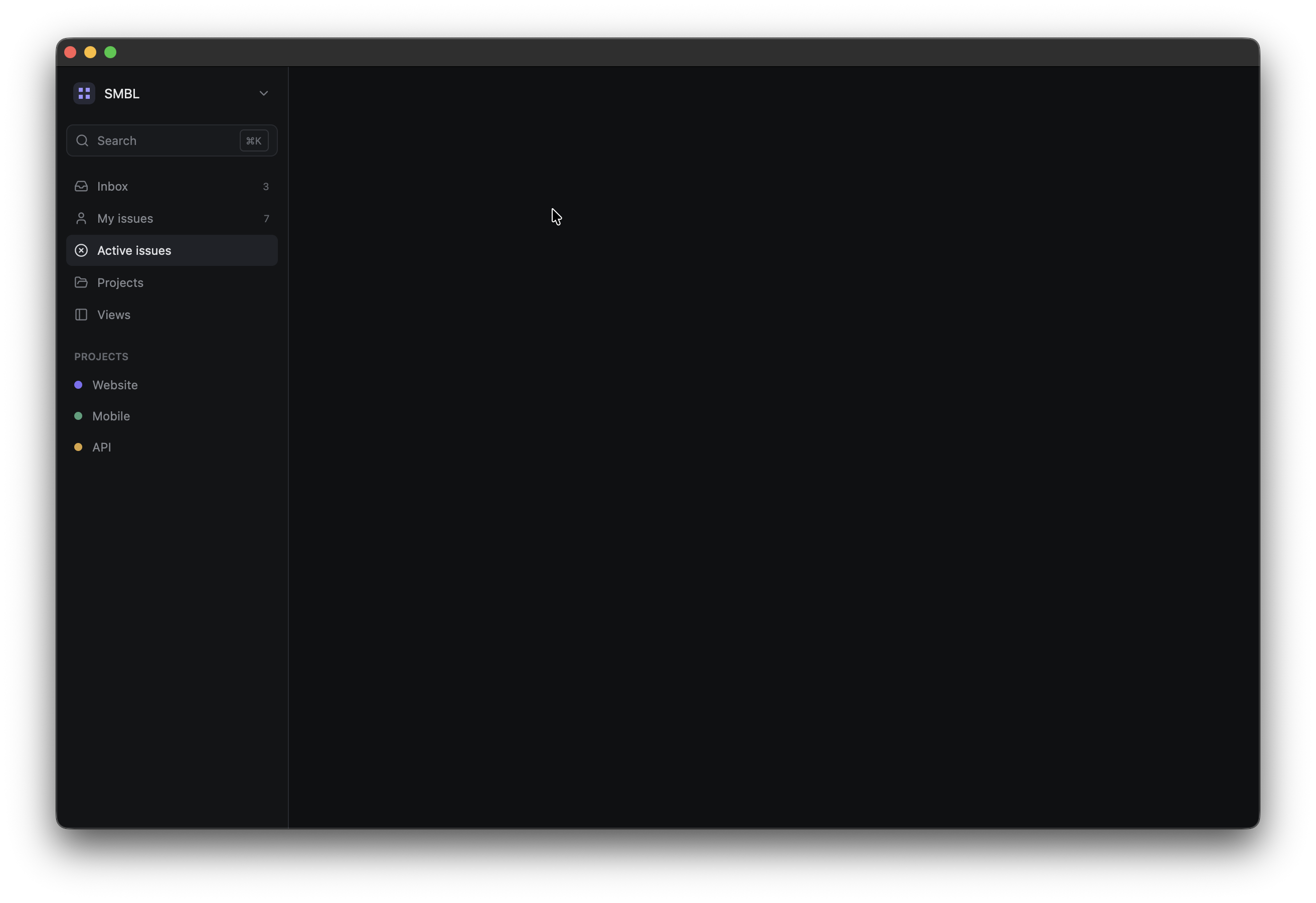
The small circles are actually themselves GPUI elements:
div()
    .size(px(8.0))
    .rounded_full()
    .bg(rgb(color))
Adding User Section to Sidebar
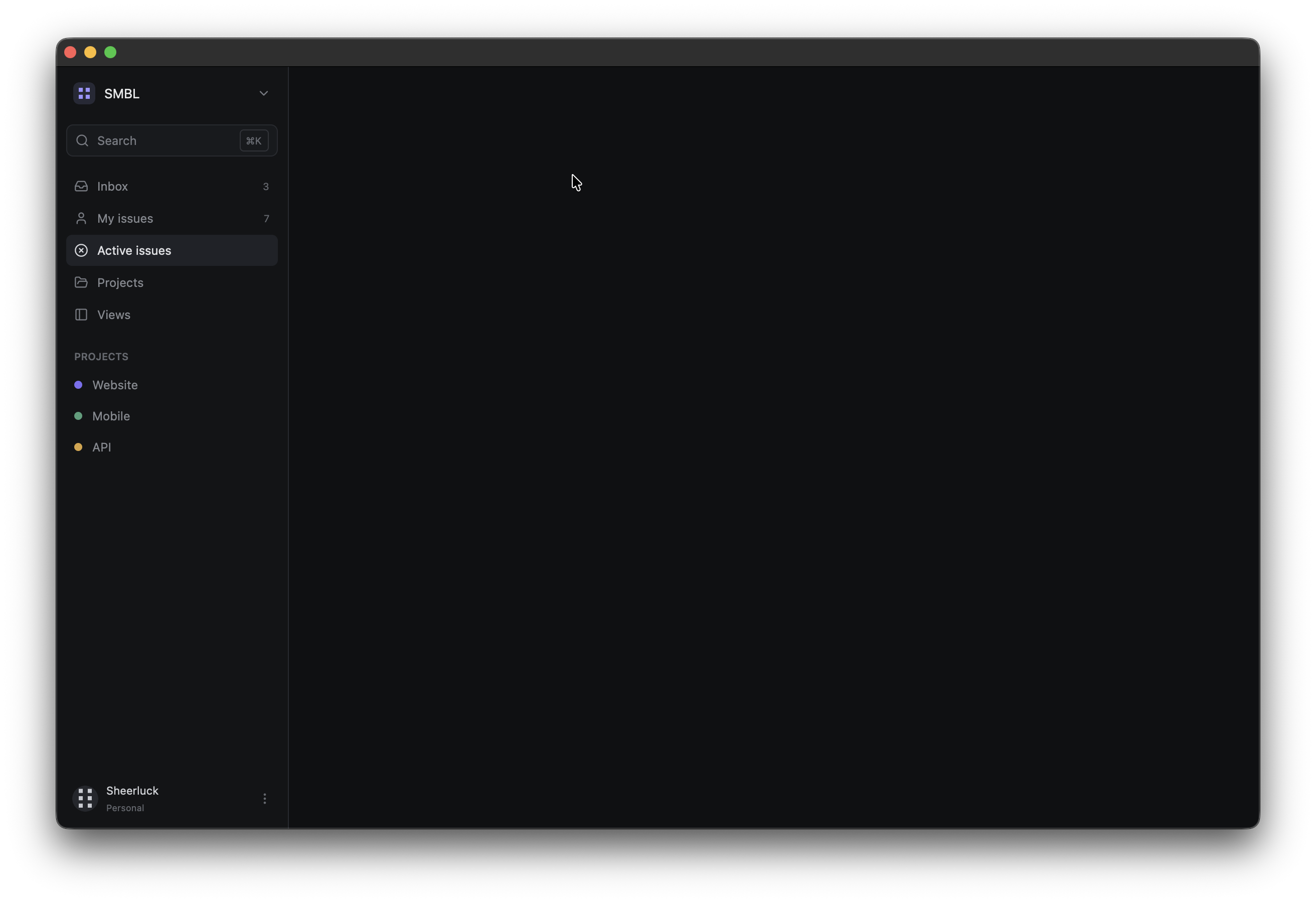
We want the user info to remain at the bottom of the sidebar just like many other apps do. Let’s add this final child to sidebar():
.child(
    div()
        .mt_auto()
        .h(px(40.0))
        .flex()
        .items_center()
        .px(px(6.0))
        .rounded(px(7.0))
        .hover(|this| this.bg(rgb(0x1d2024)))
        .child(img("user.svg").size(px(26.0)).rounded_full())
        .child(
            div()
                .ml(px(8.0))
                .flex_1()
                .flex()
                .flex_col()
                .justify_center()
                .gap(px(1.0))
                .child(
                    div()
                        .text_size(px(11.0))
                        .text_color(rgb(0xd0d2d6))
                        .child("Sheerluck"),
                )
                .child(
                    div()
                        .text_size(px(9.0))
                        .text_color(rgb(0x656970))
                        .child("Personal"),
                ),
        )
        .child(
            Icon::new(IconName::EllipsisVertical)
                .size(px(14.0))
                .text_color(rgb(0x656970)),
        ),
)
If you’ll run it, you can see something like this:
Building the Main Content Area
Now, lets work on the right side as we finished working on the sidebar. Replace the main_content() with this:
fn main_content() -> impl IntoElement {
    div()
        .flex_1()
        .h_full()
        .flex()
        .flex_col()
}
We are making this main content layout as a flex container and a vertical flex container just like the sidebar
This will contain two major sections: header and content. Lets start with the header section.
Creating the Header
Add this as the first child of main_content():
.child(
    div()
        .h(px(56.0))
        .flex()
        .items_center()
        .px(px(28.0))
        .border_b_1()
        .border_color(rgb(0x272a2f))
        .child(
            div()
                .text_color(rgb(0x686c74))
                .text_size(px(12.0))
                .child("Issues"),
        )
        .child(div().mx(px(8.0)).text_color(rgb(0x44474d)).child("/"))
        .child(div().text_size(px(12.0)).child("Active"))
        .child(div().flex_1())
        .child(
            div()
                .flex()
                .items_center()
                .gap(px(6.0))
                .child(Button::new("filter").ghost().label("Filter").small())
                .child(Button::new("sort").ghost().label("Sort").small())
                .child(Button::new("new").primary().label("New issue").small()),
        ),
)
Once you run it, you should see this:
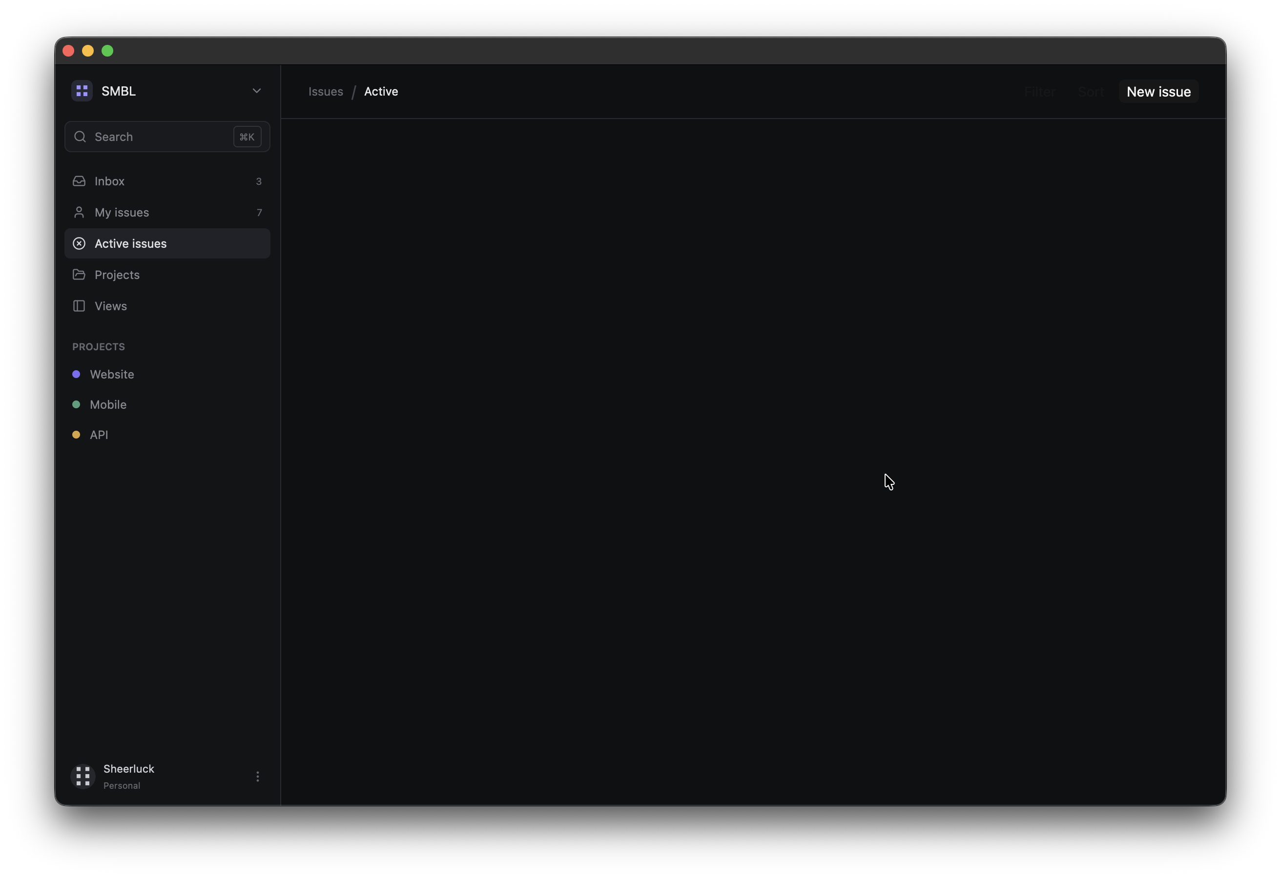 There’s one thing that I want to explain:
 ghost() comes from GPUI Kit’s component layer for its Button component. It’s just a styling thing; we are not creating this style manually.
Creating the Content Area
lets add the main content below the header:
.child(
    div()
        .flex_1()
        .px(px(44.0))
        .py(px(30.0))
        .flex()
        .flex_col()
        .gap(px(24.0))
)
run it and you should see nothing different but this adds some spacing to our app for the main content.
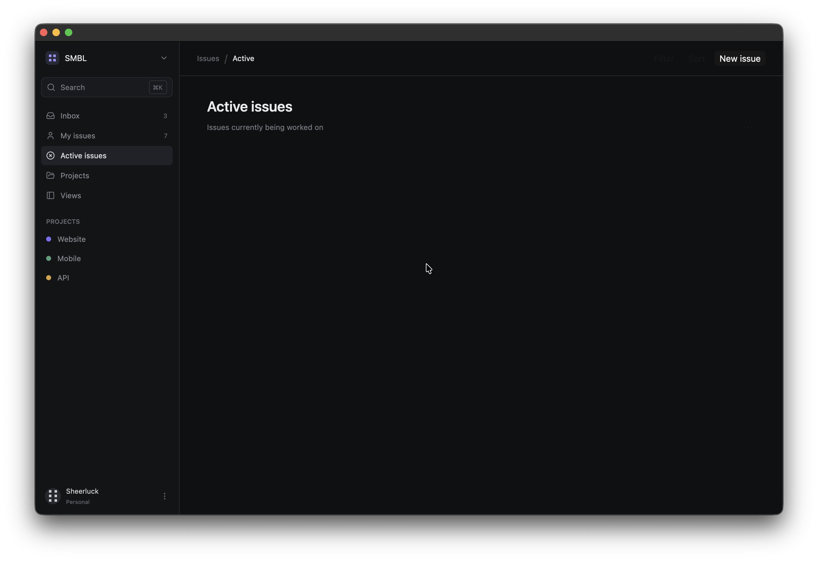
Adding the page Heading
inside the content container, add this:
.child(
    div()
        .flex()
        .items_end()
        .child(
            div()
                .flex_1()
                .child(
                    div()
                        .text_size(px(23.0))
                        .font_weight(FontWeight::SEMIBOLD)
                        .child("Active issues"),
                )
                .child(
                    div()
                        .mt(px(5.0))
                        .text_size(px(12.0))
                        .text_color(rgb(0x777b83))
                        .child("Issues currently being worked on"),
                ),
        )
        .child(Button::new("more").ghost().label("•••").xsmall()),
)
Now, if you will run this, you can see that the heading for main content page is there
Adding Tabs
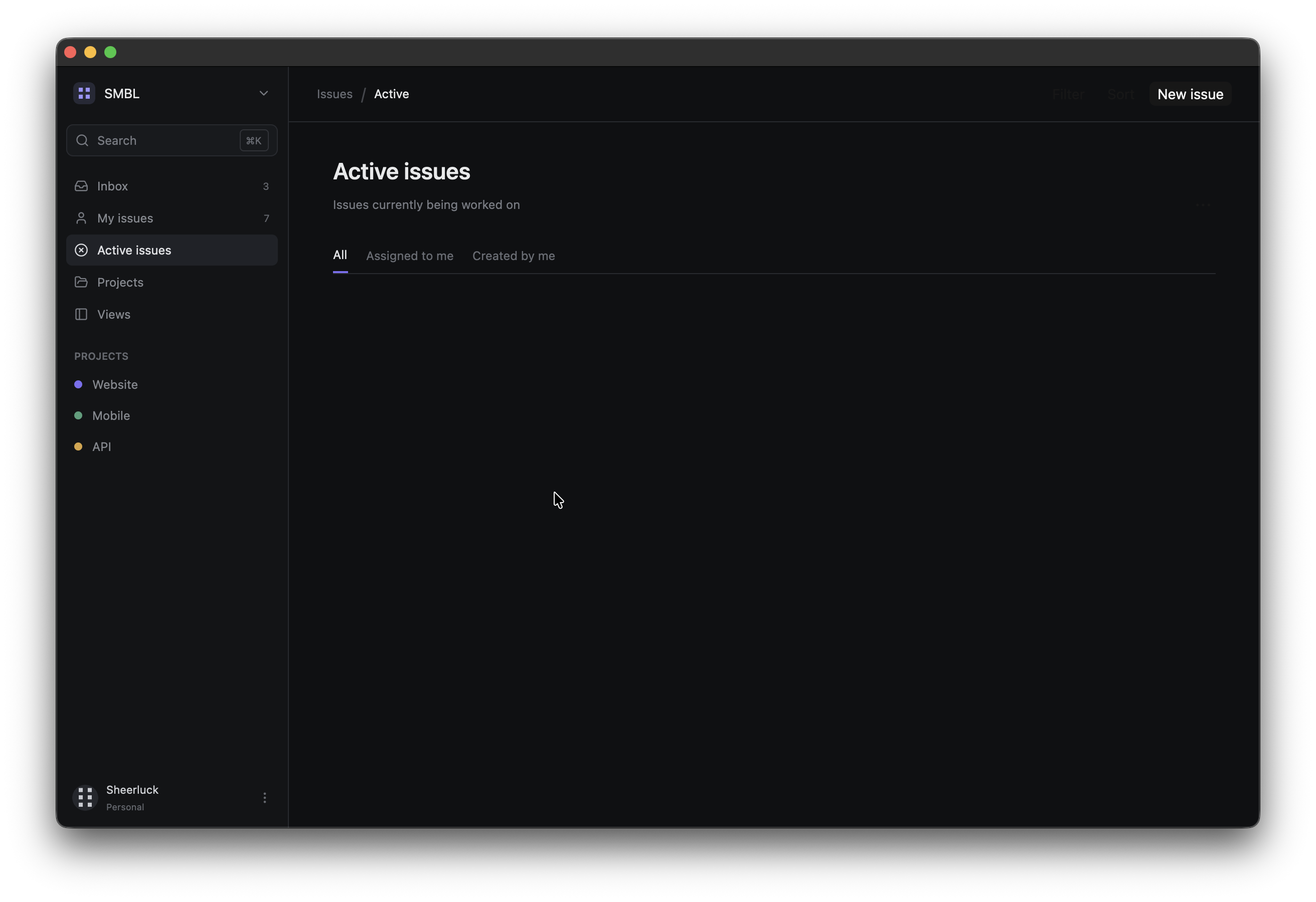
Lets add tabs to the main content. In these tabs, we will show options tabs like “All”, “Assigned to me” and “Created by me”. We will follow the same reusable helper function pattern:
fn tab(label: &'static str, active: bool) -> impl IntoElement {
    div()
        .h_full()
        .flex()
        .items_center()
        .text_size(px(12.0))
        .text_color(if active { rgb(0xe2e3e6) } else { rgb(0x696d75) })
        .when(active, |this| this.border_b_2().border_color(rgb(0x7c6ff2)))
        .child(label)
}
Now add the tab container below the heading:
.child(
    div()
        .h(px(36.0))
        .flex()
        .items_center()
        .gap(px(18.0))
        .border_b_1()
        .border_color(rgb(0x272a2f))
        .child(tab("All", true))
        .child(tab("Assigned to me", false))
        .child(tab("Created by me", false)),
)
You should see something like this:
Creating Issue Group Headers
Lets create a group_header helper function. These group headers will be used to set the title for a group and then we can have multiple issues per group
fn group_header(name: &'static str, count: u32) -> impl IntoElement {
    div()
        .px(px(8.0))
        .py(px(8.0))
        .flex()
        .items_center()
        .gap(px(7.0))
        .child(
            div()
                .text_size(px(10.0))
                .font_weight(FontWeight::SEMIBOLD)
                .text_color(rgb(0x777b83))
                .child(name),
        )
        .child(
            div()
                .text_size(px(10.0))
                .text_color(rgb(0x50545b))
                .child(count.to_string()),
        )
}
Building the Issue Component
The issue cards contain more information so lets create a reusable issue() function, these issue cards will be part of a certain group:
fn issue(
    id: &'static str,
    title: &'static str,
    team: &'static str,
    assignee: &'static str,
    updated: &'static str,
    priority: &'static str,
    priority_color: u32,
) -> impl IntoElement {
    div()
        .h(px(60.0))
        .flex()
        .items_center()
        .px(px(12.0))
        .rounded(px(7.0))
        .border_1()
        .border_color(rgb(0x202227))
        .bg(rgb(0x141619))
        .hover(|this| this.bg(rgb(0x1a1c20)).border_color(rgb(0x303339)))
        .child(
            div()
                .size(px(16.0))
                .rounded_full()
                .border_2()
                .border_color(rgb(priority_color))
                .mr(px(11.0)),
        )
        .child(
            div()
                .flex_1()
                .flex()
                .flex_col()
                .gap(px(3.0))
                .child(
                    div()
                        .flex()
                        .items_center()
                        .gap(px(8.0))
                        .child(
                            div()
                                .text_size(px(13.0))
                                .font_weight(FontWeight::MEDIUM)
                                .child(title),
                        )
                        .child(
                            div()
                                .text_size(px(10.0))
                                .text_color(rgb(0x5f636b))
                                .child(id),
                        ),
                )
                .child(
                    div()
                        .flex()
                        .items_center()
                        .gap(px(4.0))
                        .text_size(px(10.0))
                        .text_color(rgb(0x656970))
                        .child(team)
                        .child("·")
                        .child(format!("Updated {updated} ago")),
                ),
        )
        .child(
            div()
                .px(px(7.0))
                .py(px(3.0))
                .rounded(px(4.0))
                .bg(rgb(priority_color))
                .text_color(rgb(0x101113))
                .text_size(px(9.0))
                .font_weight(FontWeight::SEMIBOLD)
                .child(priority),
        )
        .child(
            div()
                .ml(px(16.0))
                .size(px(26.0))
                .rounded_full()
                .bg(rgb(0x30343b))
                .flex()
                .items_center()
                .justify_center()
                .text_size(px(10.0))
                .text_color(rgb(0xc4c6cb))
                .child(assignee.chars().next().unwrap_or('?').to_string()),
        )
}
I think this is a great example of why composition is so useful. Here, every issue has the same visual structure but the values changes like title, team and all the other parameters that the function is taking as input.
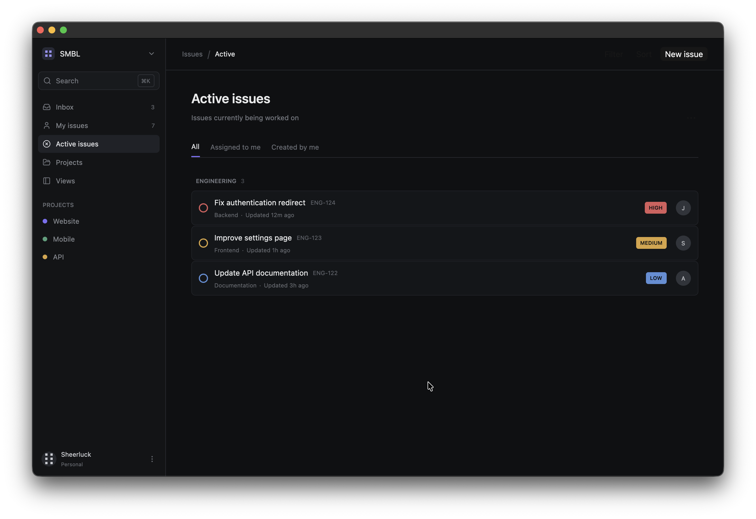
now that we have the reusable component with us, lets add this to the content container after the tabs:
// Engineering
.child(
    div()
        .flex()
        .flex_col()
        .gap(px(1.0))
        .child(group_header("ENGINEERING", 3))
        .child(issue(
            "ENG-124",
            "Fix authentication redirect",
            "Backend",
            "John",
            "12m",
            "HIGH",
            0xd95c5c,
        ))
        .child(issue(
            "ENG-123",
            "Improve settings page",
            "Frontend",
            "Sarah",
            "1h",
            "MEDIUM",
            0xd9a441,
        ))
        .child(issue(
            "ENG-122",
            "Update API documentation",
            "Documentation",
            "Alex",
            "3h",
            "LOW",
            0x5b8fd8,
        )),
)
Now, you should see something like this, you can actually use some custom icons if you want for those priority labels.
Adding the Product Issues
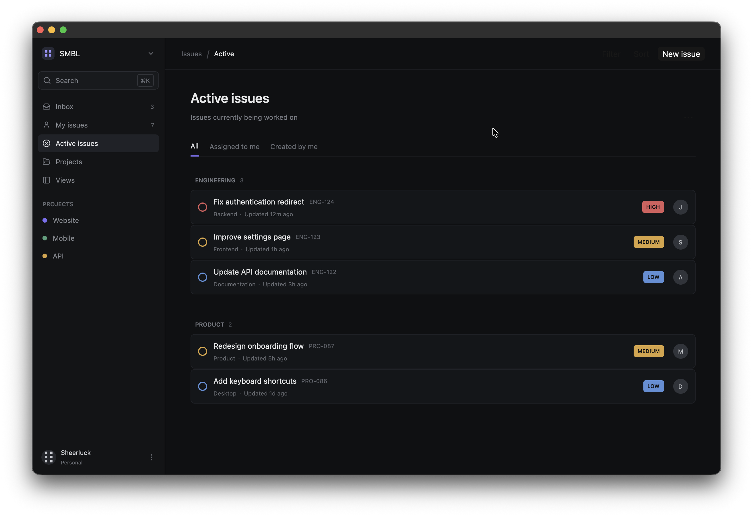
Lets add one more product group to see how it looks with multiple products on the page:
.child(
    div()
        .mt(px(12.0))
        .flex()
        .flex_col()
        .gap(px(1.0))
        .child(group_header("PRODUCT", 2))
        .child(issue(
            "PRO-087",
            "Redesign onboarding flow",
            "Product",
            "Maya",
            "5h",
            "MEDIUM",
            0xd9a441,
        ))
        .child(issue(
            "PRO-086",
            "Add keyboard shortcuts",
            "Desktop",
            "David",
            "1d",
            "LOW",
            0x5b8fd8,
        )),
)
If you’ll run it, you’ll see something like this:
Adding the Issue Count
Lets add one last thing, this will be our small summary for the content area:
.child(
    div()
        .pt(px(12.0))
        .text_size(px(11.0))
        .text_color(rgb(0x555960))
        .child("Showing 5 of 24 active issues"),
)
This is the final look that we will get
Summarising What we just built
We started with a single element div().child("Hello, GPUI!"), then we slowly added elements and worked with parent-child and sibling element structure, customised each element with chained methods for styling.
We controlled the dimension with these:
.w(...)
.h(...)
.size_full()
we learned how to implement spacing using these:
.px(...)
.py(...)
.pt(...)
.mt(...)
.ml(...)
.gap(...)
colours by using these:
.bg(...)
.text_color(...)
borders from these:
.border_1()
.border_r_1()
.border_b_1()
.border_2()
.border_color(...)
We used flex_1() to let elements consume the remaining space, mt_auto() to push the user section to the bottom of the sidebar, and finally we also used some condition based methods:
.when(...)
.when_some(...)
.hover(...)
I hope you at least got the gist of how to design a descent UI with GPUI, we still need to learn how to make the interface respond to the user and that is what we will do in our next article and we will stick to this single project for our entire series. See you soon